
Alongside the new feature work we have underway, our art team is looking at improving the traits used by cards when you deploy them to the battlefield. Rather than me trying to explain what we’re doing here and why, I asked our concept artist, Becky, some questions:

Are you revisiting both traits and Warlord special rules?
Right now we’re just looking at revisiting our existing traits – special rules are on the list don’t worry! Traits offer a great stepping stone for tech and art to work out what we want to do; the special rules are, well, special and we really want to make them feel that way, so they’re a little later down the line.
Work-in-progress concepts of the Poison trait building up, firing at the target enemy, triggering each turn and persisting on the affected enemy.
Why are we looking at traits now?
We’ve thought about redoing traits for a while, and with the battle / server improvements being made if we updated visual treatments simultaneously it meant we could help ‘design’ some of the extra technical requirements we need. We want to make traits feel really rewarding, with clear visuals and our more seasoned players will see some really kick ass visual payoffs when they’re played against each other. All while keeping it as slimline as possible so we’re not adding extra time onto the gameplay!
Are you redoing all the traits at once or in stages?
We have a lovely list of traits including ones that aren’t in game quite yet, for now we’re focusing on the current set of traits available before adding any new ones into the pool.

Work-in-progress concepts of a trait building up then targeting your own cards.
What are your concept images used for?
The goal of these concepts is to solve a lot of questions we had at the time of creation – what sequence of events needed to happen, what order they should happen, what should they look like? Once we have some visuals going they help evolve the conversation for all parties involved. They outline any extra steps we may need help with from code, are the colour and shapes feeling different enough from any other traits we’re looking at and is it clear what is happening from an art and design perspective?
What do the storyboards in this blog post show?
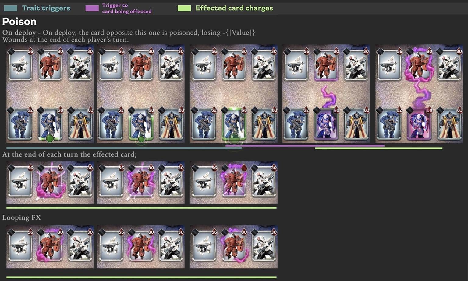
These storyboards go through the intended sequence for the traits, when the trait triggers, and the traits own special branding. Some traits for example fire an effect to the card they’re going to affect – the affected card for gains a status effect which now stays on the card until told otherwise, with the poison effect damaging the card at the end of each round for example.

This work-in-progress concept shows how even the effects which move from the trait to target cards need to be concepted, discussed and an option chosen.
Any notes on the colours used?
The goal is to have a ‘brand’ associated with each trait, so whenever you see them you understand what’s happened to your cards. There is quite a good Ted talk on visual language “You are fluent in this language and didn’t even know”, essentially it boils down to us being able to read symbols and colours and understand what it means without ever having to give it a second thought.
So when it comes to our game, there are a few choices that come quite easily – for instance most first aid boxes are green with a plus symbol on, that gives us a great start for our healing traits and looking to any Warhammer 40,000 references that already exist that we can base them on.
When thinking about poison we want the player to feel powerful when using it, but if they’re the unlucky ones to have been poisoned to know it’s bad news. Movies and existing games have probably already helped build up a picture in your head of what this looks like, a bubbling acid? Maybe it’s airbourne so it’s a cloud? It’s something a bit mysterious, evil, so it’s movement and shapes should reflect that using colours such as purple and green together traditionally have those connotations with them (Joker, Maleficent).
Something we need to be aware of is some traits can leave status effects on other cards, which can stack up over each other, so we need to give enough visual space for all of them to have an equal place.
What’s the next step?
There will be some evolutions from these early concepts – some things only present themselves when actually in game and moving. From these concepts we’ll work out a visual breakdown of assets needed for each of the stages of the effect and get them working in game to make sure they’re as clear and as slick as possible.
Conclusion
Thanks, Becky, for the detailed insight into the concept work that goes into every feature of the game. Hopefully it gives an idea of why it takes us time to implement new stuff – we’re a small team and this sort of polish takes time!
Let me know if you’d like more articles from our artists, coders and support staff, whether that’s work-in-progress posts like this or a look at recently completed work.
You can get in touch by leaving a comment below, through our Facebook page or by mailing [email protected]. Also, if you’d like to follow our posts through RSS you can use this link: https://www.combatcards.com/feed/
Thanks,
Stu
U da Maine, Stu.
Cool insight, I thought. I’d like to hear more from different people working on the game!
I get that these are just concepts and appreciate the insight into the team and process… But these concepts are from the middle trigger only. It’s going to look less visually appealing when cards are triggering from the left or right to the team or enemy team. Also many of the traits are quite new, so why are they being worked on visually so soon?
Other than the lingering effects of posion/fear/regeneration we’re talking about a few seconds of triggering.
Also the “chosen” concept of medicae is barely visible compared to the others
Thanks a lot for the feedback – I’ll pass it on to the artists.
Re. why we’re making the changes to the newer traits so soon, as mentioned we’re taking the behind the scenes work going on to battles as an opportunity to bring all the traits up to the same level (including ones that aren’t in the game yet). Part of this work is establishing a common visual language shared by all the traits, so it’ll be easier for us to add new ones in the future.
And when do you stop kidding the people here and rather take care of the game balance or is it normal that an almost max deck of the orcs by Watch Captain Artemis with its special rule is almost completely destroyed in just one move or if the opponent’s card is only I still have 21 HP but 25 Dmg and this card still remains with 1 HP, which costs me the valuable victory. Is that normal? There is constant talk of adjustments and balance improvements, but nothing happens, on the contrary, it gets worse and more ridiculous. I love this game but with opponents like in the current campaign against watch Captain Artemis it’s no longer fun and I’m not the only one with that. This card must be nerfed instead of weakening other card builds or even making them unplayable in this way!