Each card in the game is made of two main elements – the miniature and what we’ll call the border (which includes the various icons and numbers for attack values, points cost, Wounds, etc.).
Naturally, the miniatures are the stars of the show, because since their first appearance in the ‘80’s, Combat Cards have always included one, and who wouldn’t want to own a collection of models beautifully painted by the ‘Eavy Metal team?
This means that the card backgrounds have to frame the miniatures without overwhelming them, while clearly displaying the various elements you need to know to play the game. They also need to adhere to the Warhammer 40,000 ‘graphic style’ of solidity and weight, with gothic embellishments.
We also knew that our card borders were going to be used on the new, physical edition of Combat Cards (released by Games Workshop at the end of 2017), and while a you can tweak a videogame’s art as often as you like, physical products take a long time to manufacture, so need their assets locked down a long way in advance.
All of this meant the card borders went through an intense period of experimenting, tweaking, discarding and revising before we arrived at the one you see in the game. Below are concepts and tests of the various directions we tried, including images of the Chaos faction’s card borders (up until now all the cards we’ve shown have used the Space Marine faction’s background, but over time this will be replaced with each faction’s unique card background).
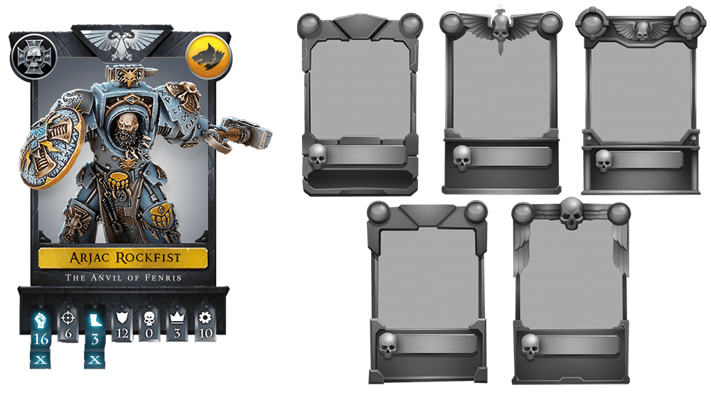
On the left is our initial concept for how cards would look. At this point we still displayed loads of stats for each card, including ‘body type’ and ‘sub-faction’ in the top corners.
On the right you can see the different border designs we experimented with, including how best to show each faction’s icon (which did end up in the top centre). The concepts are black and white so the discussion revolves around shapes and ‘weight’, before we get onto details like colour and texture.
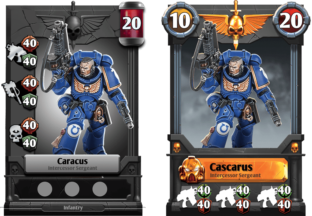
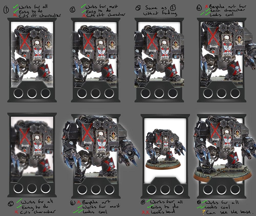
Because these are digital cards (and therefore don’t have manufacturing limitations) even apparently simple areas like ‘do the miniatures stick out of the card borders?’ need to be considered. Here are various approaches we tried, taking into account showing the miniature in the coolest possible way, versus having miniatures ‘crossing over’ each other too much and making the battle difficult to read.
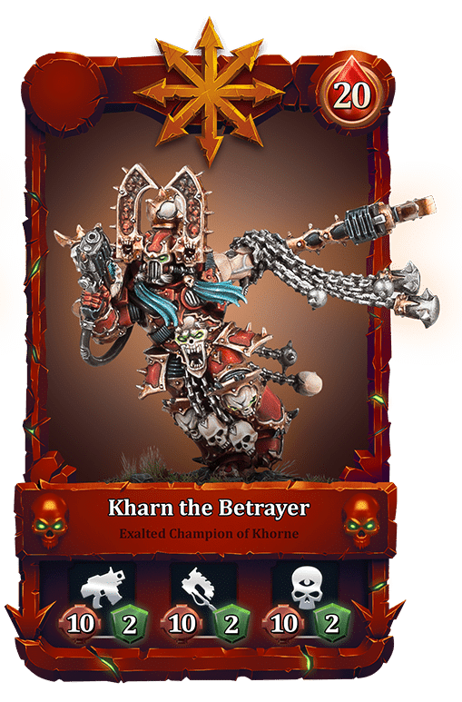
This is a work-in-progress example of what card borders will looks like for our Chaos faction (though the attack stats at the bottom have changed slightly since this example was produced). Note how this border brings in classic Chaos elements, including a more suitable colour, more spikes, and more skulls.
Over time, we plan to produce a unique card border for each faction making them feel more distinct, and helping players who are new to 40K quickly identify which faction cards are from.
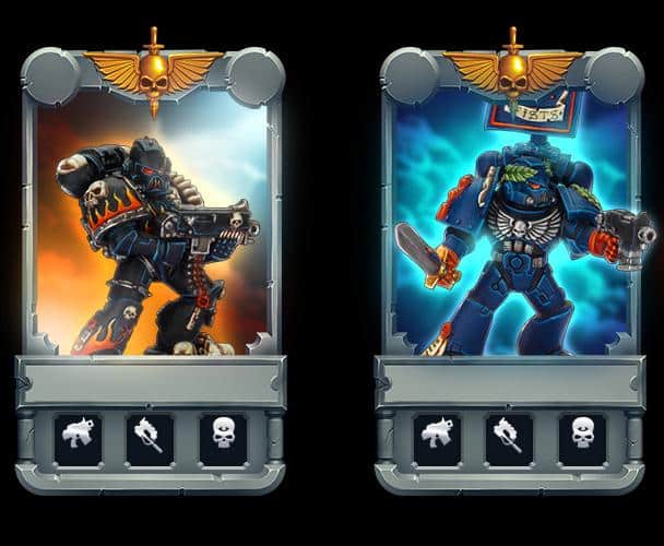
Finally, these are examples of different ways we considered to show card rarity through its background colour and effects. In the end we dropped this approach, and instead show rarity through the card’s outer glow and the colour of the bar behind their name. The difficulty with the ideas above came from finding colours that suited every character from every faction, without overwhelming the miniature in the card.
Thanks for reading. Hopefully that gives some insight into how much effort goes into seemingly minor elements of the game, and shows how we’re integrating miniature artwork provided by Games Workshop into new artwork produced by us. As ever if you have any questions or feedback please mail [email protected] or visit the Combat Cards Facebook page.
Thanks,
Stu
Trackbacks/Pingbacks